Too small

Browser needs to be wider!

About

These guidelines have been created by the Barbican Studio, which is the in-house design team at the Barbican Centre, London. The Studio creates most of the visual material for the Centre. It is based in the Marketing Department and consists of four permanent designers.

The current structure of the design team was created in 2011 and coincides with a major rebranding project undertaken by North. The philosophy of the team is based on the visual guidelines North created at the time. These set out a flexible system influenced by the Centre’s vision of ‘arts without boundaries’ and includes strong visual elements that allow freedom and diversity.

For further information contact design@barbican.org.uk

Browse

Assets

2.1

Wordmark

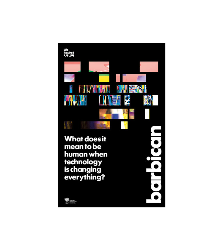
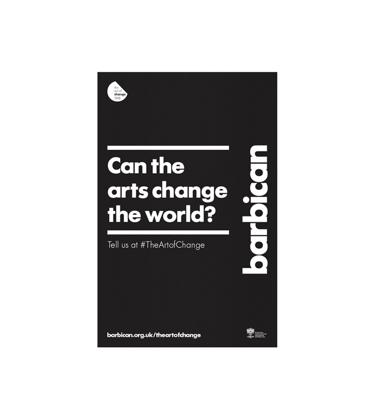
Our bold and confident wordmark

The cornerstone of our visual identity is our wordmark.

There are rules for its application, but we have created a flexible system that allows freedom and diversity.

Read more

Assets
2.1.1

Fonts

Futura is our voice

We only use one font.

Futura is at the core of our visual identity and synonymous with our brand.

Read more

Assets
2.1.2

Carrier

Our expression, our carrier

Our carrier is a strong visual unit, we can be bold, dynamic and expressive with it.

Using it with our wordmark, we create a fresh new visual language that’s instantly recognisable as the Barbican.

Assets
2.1.3

Crops

Letter crops

We have also created crops of the wordmark which can be used as graphic shapes or image carriers.

They can be used as negative or positive space.

However, they can’t be used alongside the standard carrier.

Assets
2.1.4

Space

Space is good

Space is good

It doesn’t take away, it adds.

One clear message makes more impact than many, all clamouring for attention.

Achieving a clear communication demands work and sometimes compromise. But clarity and confidence are what counts in a fierce, congested communication environment.

Assets
2.1.5

Crest

City of London crest

The City of London is the Barbican’s principal funder. Its crest appears with on everything we create.

It always includes the credit line which is supplied as a lock-up with the crest.

There are four colour variants.

Read more

Assets
2.1.6

Themes

2.2

Intro

Annual Themes

We have annual themes which link events across the Centre.

Each year a lock up is created to use with events that are part of the annual theme programme.

The lock up is positioned in a corner of the layout. Its size is relative to the size of the layout.

Updated Feb 19

Themes
2.2.1

2019

Life Rewired

This year our annual theme is Life Rewired. A season exploring what it means to be human when technology is changing everything.

barbican.org.uk/liferewired

Read more

Updated Mar 19

2019
Themes
2.2.2

2018

Art of Change

In 2018 our annual theme was the Art of Change. A season exploring how the arts respond to, reflect and potentially effect change in the social and political landscape.

barbican.org.uk/theartofchange

Updated Dec 18

2018
Themes
2.2.3

Venues

2.3

Level G

Level G

Level G is a system for packaging up our free, always open offer alongside a growing programme of events and installations in our public spaces.

Read more

Updated Dec 18

Venues
2.3.1

Shop

Barbican Shop

The Barbican Shop is our main retail outlet on the foyer.

It has its own wordmark and colour palette.

Read more

Updated Nov 18

Venues
2.3.2

Partners

2.4

Template

Working with partners

When we work with partners we have templates which depend on the relationship and degree of collaboration.

Read more

Updated May 19

By Matt Saull

Partners
2.4.1

Option 1

Option 1
Joint promotions

When we work with a partner on an equal basis, we use this layout option.

The wordmark is half the height of the artwork and the partner logo is top left or right.

The City of London crest is also included.

Updated May 19

Partners
2.4.2

Option 2

Option 2
Associates

Residents and associates use this option on their own promotion layouts.

The artwork includes a partner lock-up in the bottom left or right corner. There are currently 6 partner lock-ups:

Read more

Updated May 19

Partners
2.4.3

Option 3

Option 3
Rentals

When a company is renting a Barbican venue they use this layout.

It includes a venue lock up with travel information.

Read more

Download

Updated May 19

Partners
2.4.4

Option 4

Option 4
Sole supporter

This layout is used if the Barbican is the sole partner/supporter of a project.

The wordmark is quarter the width of the artwork and sits bottom left or right.

Read more

Updated May 19

Partners
2.4.5

Option 5

Option 5
Joint supporter

The horizontal wordmark can also be used when the Barbican is a joint partner/supporter.

Size and spacing is agreed in advance with other partners/supporters.

Updated May 19

Partners
2.4.6

Gsmd

Guildhall School of Music & Drama (GSMD)

The Barbican has a creative alliance with the Guildhall School of Music & Drama.

When we work together, we include our wordmark and the GSMD logo.

Read more

Updated Feb 19

Partners
2.4.7